



Read More











At least six hikers fall ill on Chung Yeung Festival holiday
19-10-2026 17:22 HKT

Macron and wife dance at Celine Dion concert amid French riots
19-10-2026 13:26 HKT
I have been writing about climate change and climate scientists for years, and I have been frustrated by a disconnect between scientists and the public that I’ve seen time and again. Scientists and researchers often discuss global warming in the context of risks that will arise if the planet’s average global temperature rises more than 2 degrees Celsius (3.6 degrees Fahrenheit) above pre-industrial levels. Scientists aside, what is an ordinary person to make of that? Not much, in my experience.
Another frustration: There is no shortage of stories predicting the dire consequences we face if we don’t find a way to stop the planet’s temperature from rising beyond that threshold. But what about now? What has already happened? And why do these dire warnings so often land with a shrug?
So I asked myself, “How do most people interact with weather and temperatures?” They get up in the morning and wonder how hot and how cold it will be. No one asks themselves, “What will the average temperature be today?” And when they wake up on the seventh day of a summer heat wave, they might groan and ask, “Will this ever end?” They might also lament that there have been several such heat waves this year, more than they remember growing up.
Heat waves, it seemed to me, are the connective tissue between the science of global warming and our everyday experience. Heat waves are something people already understand, and I thought perhaps they could help explain how much the planet has warmed in recent decades.
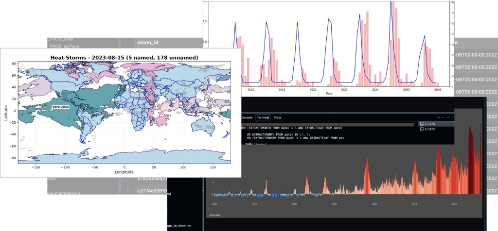
Unfortunately, no universally accepted definition of a heat wave existed. So, in consultation with climate researchers, a few of us at Reuters set out to build our own. Data journalists Ben Welsh, Charles Szymanski and I started seriously thinking about this idea in 2024, and this year Welsh rolled out the Reuters Climate Monitor, which tracks daily anomalous temperatures worldwide.
Under the hood of the Climate Monitor, however, was a more ambitious system of concepts and methods we developed to define, track and map heat waves. The fact that heat waves have become more frequent and larger didn’t surprise me – but what our data analysis turned up is breathtaking and ominous.
One thing we discovered is that we needed a new term for the largest heat waves, something simple that would instantly convey their scale and consequences. So we created a new category, the “heat storm” — defined as heat waves that at their peak cover at least 1% of the planet, about half the size of Canada. Some scientists objected to the term, because “storm” has a distinct meteorological definition. But it also has a common metaphorical meaning — “a serious disturbance of any element of nature,” per Merriam-Webster — that we believe fits these heat events.
The stories in our series, which you can read here, and our heat-storm tracking system rest on the methods and definitions below. We have also open-sourced our heat wave-tracking approach so others can conduct their own research on heat waves using a uniform definition. It can be found on our GitHub page.
We consulted two dozen researchers and scientists for this project. Four of them were particularly influential as we developed our methodology. Alistair Hobday, of CSIRO, of Australia’s National Science Agency, for his work on marine heat waves; Lukas Brunner, at the University of Hamburg, who helped with our seasonal adjustments and baseline temperature ranges; Claudio Piani at the American University of Paris, who also helped us develop our historical temperature ranges; and Ed Hawkins at the University of Reading, who convinced us that this was not a fool’s errand.
The detailed section below on Sources, Definitions and Methodology is aimed at climate and weather specialists, and it’s technical in places. For general readers, here are the essentials:
We have created a universal definition of a heat wave in consultation with climate scientists, meteorologists and weather researchers. We did this by analyzing temperatures since the 1960s for more than one million grid squares covering the entire globe.
Our process starts with determining the historical temperature range for each day of the year from 1961 to 1990 for each of the 1.04 million grid squares on the planet.
A heat wave occurs when the daily high temperature for any location reaches at least the 90th percentile of the 1961-1990 historical range – in other words, the hottest 10% – for five days in a row.
To measure the geographical extent of heat waves, we map neighboring heat wave grid squares that form a cohesive area.
Because very large heat waves have a dramatically outsized effect on people, plants and animals, we created a further definition: If at any point a heat wave covers 1% of the planet, we designate it a “heat storm” and give it a name, as is done with tropical storms and hurricanes.
Our temperature data comes from the European Centre for Medium-Range Weather Forecasts.
SOURCES, DEFINITIONS AND METHODOLOGY
ERA5, 0.25 degrees, European Centre for Medium-Range Weather Forecasts (ECMWF). This dataset incorporates a variety of climate data sources, including weather stations, satellites, weather balloons, and ship readings. It then feeds the data into a model that estimates temperature values for 1.04 million grid squares covering the planet. It is widely considered the gold standard of global climate data. (For full citation, please see below.)
1/1/1961-12/31/1990, using UTC dates with 24 hourly temperatures each day.
The estimated average daily high and low air temperatures at two meters above the ground or water surface for each of the grid squares on the planet.
High temperature threshold: 90th percentile. Low temperature threshold: 10th percentile.
“Smoothing” aims to reduce the effect of one or two unusually hot or cold days over the 30-year baseline for any given calendar day. So, for each calendar date, the Reuters baseline temperature distribution consists of 930 values: the corresponding high/low observations from that date and the 15 calendar days before and after it across the 30-year baseline period. We calculate the 90th and 10th percentile thresholds from those values. In non-leap years, we generate synthetic Feb. 29 data by averaging Feb. 28 and March 1.
Because seasonal changes can creep into the edges of our 31-day window and skew the temperature distribution, we adjust our data using the method outlined in “Pitfalls in diagnosing temperature extremes,” a 2024 Nature Communications paper by Lukas Brunner of the University of Hamburg and Aiko Voigt of the University of Vienna.
This is done by subtracting each calendar date’s 31-day average from the corresponding baseline value and then recalculating the distribution. We use that distribution, which we call the baseline range or historical range, to establish the percentile thresholds that define what qualifies as extreme. Brunner vetted the computer code implementing the seasonal adjustment technique.
A 0.25-degree grid covers about 770 km² (28 km × 28 km) in the tropics, 540 km² (28 km × 19 km) in the mid-latitudes, and 260 km² (28 km × 9 km) in the polar regions.
AREA OF THE EARTH
5,100,720 km²
The 90th percentile represents the deviation from the historical norm that 9 out of 10 days would fall below – the threshold beyond which a day’s temperature is unusually warm for that calendar date in that grid square. The 10th percentile represents the deviation from the norm that 9 out of 10 days would exceed – the threshold below which a day’s temperature is unusually cool. We calculate these thresholds from seasonally adjusted baseline temperatures. We chose the 90th and 10th percentiles based on published research and consultations with climate and marine heat wave researchers.
We identify a heat wave when a grid cell records five days with a weighted-average percentile rank at or above the 90th percentile. We did this so that slight dips below the 90th percentile on any given day don’t override the broader, obvious trend. The weighted average is calculated over a rolling 5-day window with exponential decay (factor 0.9). The decay favors temperatures on more recent days, so temperatures above the 90th percentile on day five can sometimes overcome temperatures slightly below the 90th percentile on day one or two, for example.
We apply a one-day grace period throughout, meaning a cell may fail to qualify for a single day without ending the streak. Once the grace day for a grid cell is reset, it can be reapplied the day after the cell is reintegrated. Once five qualifying days are reached, the heat wave remains active as long as the weighted average percentile rank stays at or above the 90th percentile, subject to the same grace period.
The Reuters technique adapts the definition of marine heat waves established in the 2016 paper "A hierarchical approach to defining marine heat waves" by Alistair Hobday of CSIRO and his coauthors.
A cold snap is identified when a grid cell records five days with a weighted average percentile rank at or below the 10th percentile. The weighted average is calculated over a rolling 5-day window with exponential decay (factor 0.9). A one-day grace period is applied throughout, meaning a cell may fail to qualify for a single day without ending the streak. Once five qualifying days are reached, the cold snap remains active as long as the weighted average percentile rank stays at or below the 10th percentile, subject to the same grace period.
After entering into a heat wave or cold snap state, a grid cell can remain in that state if the cell drops below/above the 90th/10th percentile for one day but rises above/below the 90th/10th percentile the following day. The grace day acknowledges that small shifts in local temperatures for one day could break the continuity of a heat wave in a way that anyone living through it might dispute. We do not use grace day cells when calculating the area of a heat wave or heat storm, and we ignore them when deciding whether a place is inside a heat wave or heat storm on any given day.
There are three geometries for heat waves and cold snaps. They are the actual geometry of the extreme weather event, which is the extent based on the grid squares in a state of heat wave or cold snap; the buffer geometry, which is used to join grid squares that are extremely close to each other but don’t touch into a common temperature event; and the grace geometries, which are used to track grace days.
Generally, we merge all grid cells that are in the state of a heat wave or cold snap and that share an edge into a unified geometry. If two distinct areas are separated by just one grid square, we consider them the same heat wave or cold snap event. The event is declared on the first day it qualifies (the fifth day of abnormal heat or cold) and is assigned a unique ID.
A heat storm or cold storm is a heat wave or cold snap whose geometry reaches at least 1% of Earth’s area, approximately 5.1 million km². This threshold was somewhat arbitrary, but is meant to capture very large and rare heat wave and cold snap events.
If a buffer geometry from today overlaps at least 60% of a buffer geometry from the previous day, it inherits that storm ID. If it overlaps several buffer geometries from the previous day at the 60% threshold, it will inherit the storm ID of the buffer geometry with the largest area of overlap. If it does not meet the 60% threshold, it will generate a new storm ID. Over time, this process can cause storms to split, merge, or be created.
A name is assigned on the first day the geometry reaches 1% of Earth’s total surface area.
Using https://github.com/philipperemy/name-dataset, we pulled the most popular names by gender for each country, scored them by rank and aggregated them by continent so names common across multiple countries within a region score higher. We grouped them into 13-letter buckets for alphabetic balance, then organized them by continent and gender to ensure global representation. We removed obvious duplicates, names with fewer than three letters, and names with ambiguous or inappropriate English meanings. From an initial list of 4,000 names, we ended up with 2,380. An algorithm names each storm using a formula that ensures storms get names from different parts of the alphabet and different world regions, with alternating genders. The name is paired with the storm’s start year to create the final identifier. Our name database is available here.
We build a 3-by-3 grid centered on the grid square where the city center lies. If any part of that grid is within the actual geometry, the city is considered to be within the heat wave, cold snap or storm. In the tropics, it typically means the area must be within about 59 km of the city; in the mid-latitudes, about 51 km; and in the polar regions, about 44 km. In rare cases, this method may place a city in two or more temperature events at the same time. In such cases, we assign the city-day to the named heat storm if one exists; otherwise, we assign it to the event that started earliest globally. We count each calendar day only once, regardless of how many events overlap.
Given that waves and storms must have been above or below the 90th or 10th percentile for five days before the start of the event, days that a city or other specific location has been in a heat wave are counted starting four days before the start date of the heat wave or cold snap. In other words, days are counted from when temperatures first become anomalous and later become a heat wave, cold snap or a storm. If a temperature event immediately precedes another temperature event, causing the events to overlap in days, we assign the four lead-in days to the larger event. So, if one event is a heat wave and the other is a heat storm, the lead-in days are categorized as heat storm days.
Temperatures are taken using the 3-by-3 grid, but only the grid cells inside the event are used and then averaged.
For a specific place or spot on the planet, we calculate the average for the historical norm, the 90th percentile temperature and the 10th percentile temperature across the nine grid squares that comprise the 3-by-3 grid.
Grid squares are assigned an intensity level based on how much any day’s temperature exceeds the 90th percentile threshold. The level is determined by the ratio of the actual anomaly to the threshold gap. So if the baseline – or historical norm – is 25 C and the 90th percentile is 30 C, the threshold gap is 5 degrees. (For readers accustomed to Fahrenheit, 30 C is 86 F.) A high of 30 C would be 5 degrees above baseline, making it a level 1 day. A high of 35 C would be 10 degrees above baseline, or twice the threshold gap, making it a level 2 day. A high of 40 C (15 degrees above baseline, three times the gap) would be level 3; 45 C (20 degrees above baseline, four times the gap) would be level 4, and so on. Contiguous grid cells reaching the same intensity level are aggregated to create a geometry for that level within the storm.
We define a cascade as heat storms that run consecutively or simultaneously for an uninterrupted period of time. The duration of a cascade is the number of days that at least one heat storm was active on the planet.
The ECMWF bases its entire system on a gridded dataset that is only as granular as each grid cell, which range in area from 260 km² in the polar regions to 770 km² in the tropics. The dataset’s temperature estimates are not actual observations but are modeled from observations, as the ECMWF explains here. The models can diverge notably from observations in complex terrain, such as high altitudes and coastal areas. For example, parts of New York City touch the Atlantic Ocean, and the temperature difference between a grid square partially covered by water and land and a grid square fully over land can be several degrees. Using a 3-by-3 grid around a particular place is one way Reuters attempts to minimize those limitations. Seasonal adjustment is another.
Copernicus Climate Change Service, Climate Data Store (2023). ERA5 hourly data on single levels from 1940 to present. Copernicus Climate Change Service (C3S) Climate Data Store (CDS).https://doi.org/10.24381/cds.adbb2d47 (Reuters updates the data daily.)
Generated using Copernicus Climate Change Service information. Neither the European Commission nor the European Centre for Medium-Range Weather Forecasts (ECMWF) is responsible for any use that may be made of the Copernicus information or data it contains.
Reuters