Last week we finally "realized" what a market free fall meant in reality.
With institutional trading being programmed, sudden sharp crashes have become the new normal.
Indeed, we have seen such crashes happen more frequently, given excess liquidity.
Since the financial tsunami, such free falls have usually been 10 to 15 percent; last week, it was 17 percent, which is comparable to the free fall that occurred in 2011.
Whenever the market is in a manic or a panic state, fundamentals that explain only the trend should be set aside.
Such market movements occur within days or even hours, so there can hardly be any change in terms of fundamentals.
The only factor that can explain the sudden changes is news, which is, by definition, unpredictable.
However, such times are exactly those when investors become interested in and harbor a strong demand for predictions.
Fundamentals only tell the trend, which has been so far so good over the past decade.
The occasional mild inversion of the yield curve is not a signal that a recession lies ahead; instead, a three-month yield lower than the 10-year one by about 50 basis points for one to two quarters is needed to turn the light red.
Good fundamentals are consistent with the market uptrend to date.
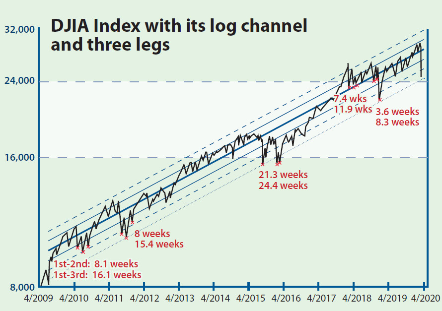
If we want to visualize that uptrend easily, then a semi-logarithmic plot with a vertical axis in a log-scale fitted with a linear channel will do.
This is because the rising speed of the logarithmic of a stock index over time is just its percentage growth over a period.
Let the stock index be, then:
Good fundamentals mean percentage growth is stable, and so too should the index.
That is, the slope of the uptrend on such a plot should be linear. A standard log-channel is the trend plus and minus two standard deviations (dashed blue lines) so that it covers the index 95 percent of the time.
Whenever the index is out of channel, this should be only a 5 percent chance of the total.
For downside (one-sided) considerations in which the Dow Jones Industrial Average index goes beyond, this constitutes 2.5 percent of the time.
Rarely does it (an additional dotted blue line at the bottom of the channel) constitute only 0.05 percent of the time, but this did happen in early 2016.
Now that the index is almost at 24,240, which is very close to the support line extended from February 2016 that currently is at 24,260, the nadir is very near.
But this is only the short-term one.
Marked on the chart are bottoms of corrections like this time around, when it all began with a fall off the cliff.
Interestingly, there are three troughs every time.
The two numbers refer to the time from the first trough to the second and from the first to the last.
It usually takes two to three months for a correction to be completed before a fresh new uptrend begins. No one knows in advance which trough would be the lowest.
And there is no guarantee that the troughs are of a similar level - the third correction that occurred in 2018 was much lower than the previous two.
If one buys on the first trough (probably now), then you'd better psychologically prepare to sit it out for a few months.
Law Ka-chung has worked in the financial industry and the government for two decades Reach him at facebook.com/kachung.law.988 or lawkachung@gmail.com