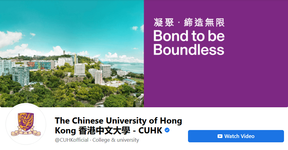
Chinese University of Hong Kong appears to have dropped a plan for a new emblem amid an outcry and reverted to the old version.
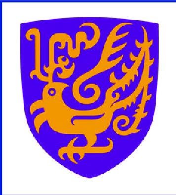
The institution launched a "brand refresh" on October 17 to mark its 60th anniversary next year, unveiling a new emblem depicting a mythical Chinese phoenix on a purple shield.
The original emblem featured half of a purple phoenix illustration on a gold background on the left and a gold illustration on a purple background on the right.
But alumni and students said they did not like the new emblem that removed the original split-color scheme that had been in use since 1964 after the university's establishment.
They said the phoenix looked like a pheasant and criticized the university for launching a simplified version of the emblem that did not feature the motto "Through learning and temperance to virtue" on a ribbon under the shield.
Two days after the rebrand sparked public outcry CUHK president Rocky Tuan Sung-chi issued a statement - bearing the new emblem - noting the university had received "valuable feedback" from staff, students, alumni and citizens.
"We will not rush the changes and, meanwhile, WE ARE LISTENING," he wrote, but did not mention second thoughts on the changes.
Tuan also claimed the simplified logo "is aligned with best practices from a range of leading international universities. Importantly, we are living in an era dominated by digital communications and the university needs to ensure its visual identity is capable of thriving in the digital world."
But CUHK Council members joined the chorus of dissent on the new emblem and said that they had not been consulted about the change despite the university claiming it had spent "nearly a year" consulting over 2,200 stakeholders on the rebrand, including staff, students, alumni, council members along with local, mainland and international partners plus the general public.
Bill Tang Ka-piu, a council member and a legislator for the Federation of Trade Unions, last week slammed university managers for handling important issues without consulting the council. So did another legislator and council member, Edward Lau Kwok-fan of the Democratic Alliance for the Betterment and Progress of Hong Kong.
Lau said it was "very disrespectful" that the university did not consult the council.
Yesterday's U-turn, which arrived without any official announcement from the university, came in the form of an updated profile picture of the previous emblem on the university's Facebook and Instagram accounts as well as on its official websites.
And a "brand portal" website dedicated to the new look fresh on CUHK's communications and public relations office site redirected users to the university's official website.
Tang also welcomed the backtracking, saying the university should take more time to discuss whether a change is necessary.
"Regarding the revival of the old school emblem, I believe it is a decision that alumni and council members across the board can accept," he said.
"But this whole process has caused a very bad situation that has once again revealed flaws in the structure of university management, which is a more far-reaching issue."
CUHK should not act recklessly, he added.
Students welcomed dropping the new emblem. "I received an e-mail soliciting student opinions as to whether they should change the emblem back," said student Lui. "I think that's quite good."
Another student, Yip, said: "The simplified version didn't have the school motto, and the emblem's old design was better. I think this is an important part of the CUHK spirit that we should preserve."
The university council will meet today, with Tuan present, to discuss the emblem issue.
cjames.lee@singtaonewscorp.com
Editorial: Page 4
The old emblem is back on CUHK's social media pages amid anger over changes that included a simplified logo, near left.
Rocky Tuan