Read More


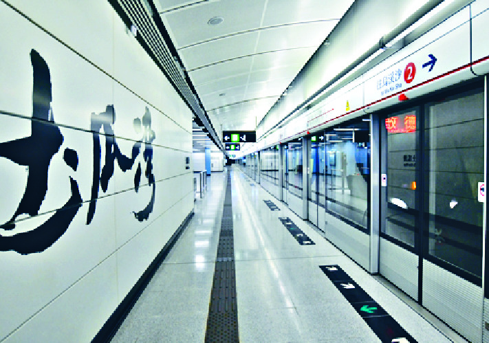
The station is painted in blue and white and the station name is written in Chinese calligraphy with black ink on the walls.
Some asked the MTR to change the color to gold. But the blue color reflects "Wan," which connects to water in Chinese, said the MTR.
In clerical script, an ancient Chinese calligraphy style, the character "To" is written differently to the similar character "Si."
For the character "Wan," it is not simplified Chinese. The truth is - the character is written in a variant form of traditional Chinese. MTR stations like Causeway Bay and Sai Wan Ho are using the same variant form of traditional Chinese when writing the character "Wan."