

Read More







China's spy chief warns of national security risks from AI
14-09-2026 20:03 HKT

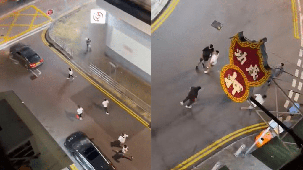
Seven arrested over Kwai Chung illegal gathering
14-09-2026 12:33 HKT


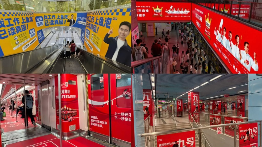
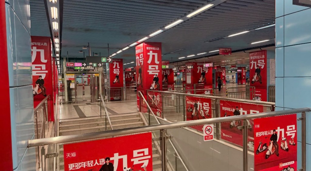
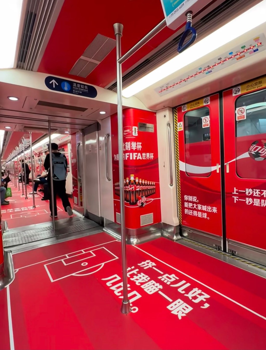
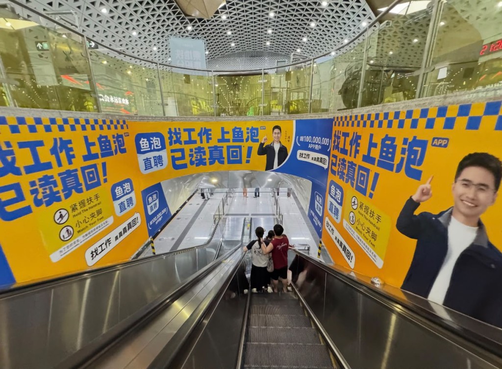
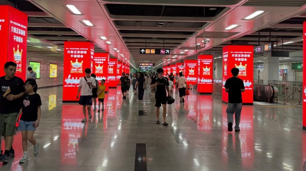
Shenzhen Metro has apologized and launched a campaign to improve advertising displays after some stations and train carriages drew criticism for excessive advertising, with passengers complaining that large, brightly colored ads caused visual discomfort.
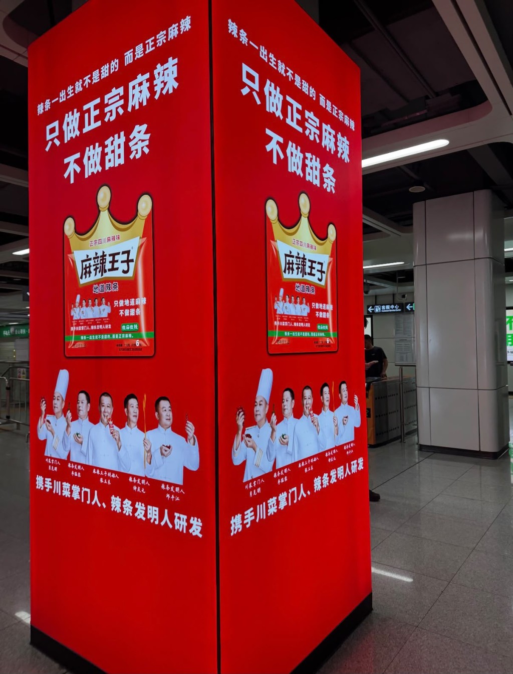
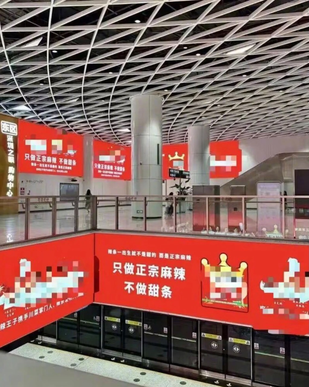
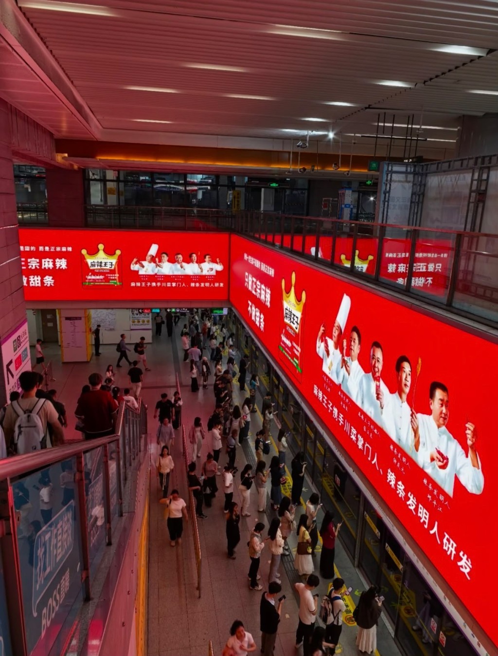
The controversy gained attention online after residents criticized the dense placement of advertisements from the same brand at several metro stations, saying the repetitive, highly saturated displays were difficult to ignore.
Shenzhen Metro said on July 15 that it apologized for the strong visual impact caused by advertisements at some stations and had begun improvement work. Large pillar advertisements at Houhai Station have been replaced, while advertisements along transfer corridors will be gradually removed between July and September. Advertisements at Gangxia North Hub will also be updated and optimized this month.
Houhai Station drew the most criticism, with passengers complaining that large red advertisements for a spicy snack brand covered the walls and corners along the transfer passage between Metro Lines 11 and 2, creating an overwhelming visual effect.
Similar complaints were raised about busy stations including Chegongmiao, Hi-Tech Park and Shenzhen North Railway Station, where passengers said high-contrast advertisements caused visual fatigue.
Shenzhen Metro Commercial Management Co Ltd said it had received multiple passenger complaints and noticed discussions on social media. The company said it would work with advertising operators and clients to adjust advertising strategies while balancing commercial value with passenger experience.
Feng Yuan, a professor at Sun Yat-sen University's School of Communication and Design, said metro stations were enclosed spaces where passengers had limited choices, making them more likely to be exposed to advertising.
He said the approach might increase brand exposure but could come at the expense of creativity and emotional connection, while excessive visual stimulation could negatively affect passengers' commuting experience.
Many online users criticized the displays, with some describing the style as a "nouveau riche aesthetic" and saying the advertising strategy had generated negative reactions instead of attracting attention.